Sunday, December 23, 2012

Mini Cabrio Print Ad

This ad attempts to make its car seem tough and manly by plying the viewer's need to aggress, and 


The main appeal in this ad is the need to aggress. The advertisers attempt to emasculate the viewer by telling them that they would cry during a hailstorm. It tells them that they can weather storms in a manly way by not bothering with sissy things like roofs. It also uses diction to create the association of toughness. It commands the viewer, telling them to stop crying. Not asking, but telling them. It also uses absolute terms such as 'always open' in bold to emphasize assertiveness and toughness. The bold, large text increases this appeal, as  large and bold text exudes an aura of assertiveness and dominance. Also, the text is in all caps, which subconsciously makes the viewer feel like the poster is yelling at the viewer in a masculine way. The simplistic design of the poster and lack of clutter makes the viewer feel more focused on the one message, which makes the message seem all the more clear, direct, and bold.

I thought this ad was moderately effective in its goals. The design of the car seems contradictory to the attempted appeal, however. The car is mini, while stereotypically masculine things are big. It is yellow, which is unrelated to masculinity. Also, convertibles, while not effeminate, are not nearly as masculine as things like trucks.

Lego Print Ad

This ad manipulates the viewer's need for curiosity and their need for aesthetics to create the association between Legos and art in the viewer's mind.


The foremost appeal in this ad was the need for aesthetics. This, and the need for escape, were used by the advertisers to make the connection between Legos and the imaginative wonderland in the mind of a child. The shadow of the plain, blocky Lego structure is an elaborate dinosaur, implying that Legos will help a person escape to their imagination, where they can leave their drab, boring life. The color schemes used in the ad also contribute to this effect; the presence of something as wondrous as a dinosaur in an environment of only two simple colors implies that there is more than meets the eye with Legos.

Lego also employs the need for curiosity in their ad. The main way this ad employs this appeal is the lack of words or significant information. People see the ad, and are not pestered with words or claims about the product. This in itself sparks curiosity and makes the ad memorable to the viewer. However, the stark strangeness of the ad also makes the viewer curios. At first glance, an ad that only features a few Lego blocks is certainly strange, as they do not really provide the viewer with a reason to buy the product. Also, once the viewer notices the shadow of the blocks, the appearance of a dinosaur in an ad is also shocking and memorable.

I liked this ad. It is simple and creative, and gets a point across not only in a way that is fun and artistic, but also in an honest way. Lego, while still using advertising appeals, is not trying to tell you anything about Legos  that isn't true, at least in my opinion. To young kids, Legos are a great toy that they can be imaginative with. 

Honda Accord Rube Goldberg Machine Ad

http://www.youtube.com/watch?v=_ve4M4UsJQo

I thought the main goal of this ad was to create an association in the viewer's mind between Honda and complex, intricate machinery, and to stand out in the viewer's mind by using an aesthetic appeal.


The ad features two full minutes of a Rube Goldberg-type machine with increasing levels of intricacy, beginning with a cog rolling down an inclined plank and ending with a ramp lowering to move a Honda Accord. All of the parts of the machine are Honda car parts. At the end, after the car is lowered, a narrator says, "Isn't it nice when things just work?"

When the viewer sees the machine, the first thing that is apparent is the precarious balance of all the parts, working seamlessly together in a clearly engineered and perfectly calibrated way. Seeing the intricate machinery working together so well gives the impression that Honda cars also are painstakingly engineered to produce such exact results. The fact that all parts of the machine are Honda car parts contributes to this; it is almost like this is what a Honda car looks like on the inside. A simple solution appeal is also used to further this message. The narrator's assertion that Honda cars 'just work' assures the viewer that regardless of the complexity of the process, Honda's product is worth buying. Also, when watching a Rube Goldberg machine, one gets a feeling of nervousness and apprehension as the process gets more complex. Seeing the complexity of the machine confuses the viewer, and makes them feel as if there are terrible, elaborate problems to be solved when making a car. Then, after the machine is successful, the narrator tells the viewer that Honda cars work, assuring the viewer that they have solved the hurdles of auto engineering.

The ad also uses an appeal to the viewer's need for aesthetics. Watching a Rube Goldberg machine is visually appealing, as you can't immediately see how it will work. The main reason this appeal works is that it subtly introduces the viewer to the product, making it memorable. Personally, I was entertained so much by the Rube Goldberg machine that at first I didn't realize it was made of Honda parts. In this way, the advertisers create memorability through aesthetics; realizing the Honda parts partway through is surprising and makes the commercial stick in the viewer's mind.

I liked this ad. I think using parts of their product in an artistic and creative way was a clever method of advertising that didn't shove anything down your throat.

Sunday, December 16, 2012

Coral Paint Ad

This ad' main goal is to convince the viewer that its product is elegant and simple. The two main ways it does this are aesthetic appeal, and need to satisfy curiosity. 


The ad's foremost appeal is its aesthetics. The viewer sees a simple, minimalist piece of art, and is interested. The artwork is a method of breaking through the clutter of other advertisements; as other ads cram more facts, brands, and pictures of people enjoying their product, Coral removes from its ads. The viewer sees it and is struck by the differences it has with other ads; mainly the lack of clutter. It makes the viewer feel more like they are choosing their own products again, because Coral is not bombarding them with direct reasons to buy their product. Another way the aesthetic appeal tries to establish desire for their product is by using the surreal, beautiful image of the crown created by the splashing paint. Obviously, not all splashing liquids form distinct shapes, let alone artistic ones, when they splash. This helps instill in the viewer the idea that Coral is special, and different from other brands because of its beauty.

The ad also appeals to the viewer through the need to satisfy curiosity. Coral mentions nothing about itself in its ad, no phone number or website. This is different from most other ads, as they try to cram their brand name down your throat so that you will remember it. The viewer is surprised by this difference, and gets the feeling that Coral isn't like other companies because of that. This piques their curiosity, and leads them to research Coral more on their own.

I liked this ad, and thought it was moderately effective at marketing its product. I really enjoy water art, and the splashing paint is very similar to it. The minimalistic design is also a refreshing novelty from the clutter.

Camel Smokeless Tobacco Ad

This ad's main goal is to tell smokers that they can simplify and enhance their tobacco experience by using Camel Smoke-Free Tobacco. It does this mainly by using the viewer's need to feel safe, and by providing a simple solution to the viewer's problem.


The most prominent appeal used in this ad is the need for safety. Any smoker who knows of the health detriments of smoking definitely feels anxious about his or her health. The main reason they do not act to change their actions, however, is the addictive property of tobacco. This ad tells tobacco users that they can be 'smoke-free' by using their product. This subconsciously makes people feel like they will be safer by using the product, as people usually talk about the health detriments of smoking and not tobacco use. It is true that smoke-free tobacco is healthier, but much of the health risk remains.

The ad also employs the simple solution appeal to make viewers want their product. It claims it will make tobacco consumption 'smoke-free, spit-free, and drama-free.' By doing this, it tries to make readers think that it is solving many of the problems with smoking with their product, but it is unlikely that many health risks come from the drama of smoking. The ad also compares its product with quitting tobacco. It offers an easy solution to the very difficult problem of quitting smoking. It targets people who are trying to quit smoking, but can't quite make it.

I really disliked this ad, because of what it tries to do to those who are quitting smoking. Weaning oneself financially and physiologically from tobacco is a very positive thing, and is done because of the obvious downsides to smoking. What this product is doing is offering a middle ground that will tempt many into remaining addicted, hurting their health and their wallets.

Ford F-150 Commercial

http://www.youtube.com/watch?v=KnfE5zODgak
The main goal of this advertisement is to make the viewer feel confident in the design of the new Ford F-150.  It does this mostly by using the need to feel safe appeal, and the facts and figures technique.


The need to feel safe appeal is not obvious at first when watching this ad, but it is present. The advertisement attempts to make the viewer feel overwhelmed by the science that goes into perfecting a car, and then offers the trusty engineers at Ford as a solution. It says, "I figure the engineers who built the all-new '09 Ford are probably the same guys cheated off of in science class. We're thinking about pizza, they're thinking about aerodynamic wake properties." The goal of this introduction to the product is to make the viewer feel that they are not good judges of what makes a car valuable, and that they should instead trust the Ford engineers to make the decision for them. The advertisers try to do this by lumping the viewers in with the narrator, who thought about pizza in science class and has neither the inclination nor the capacity to learn what aerodynamic wake properties. However, they also use subtler techniques: diction and visual cues. The words used when the narrator is describing the engineers are simple, such as 'built' instead of 'designed' or 'produced'; idioms like 'I figure'; and the word 'guys' instead of 'people' or 'men.' The visual cues in the beginning of the commercial also suggest this to the viewer. Whenever the narrator mentions an engineer, a person in a suit flipping pages on a clipboard is shown, sometimes writing. This subconsciously gives the viewer the idea that those people are the authorities on all things cars. However, when the narrator mentions 'us' (the people who thought about pizza and cheated in science class), a casually-dressed, slack-jawed schmoe is shown drooling about the pizza in a thought bubble above him. This further reinforces the idea in the viewer's mind that they are unqualified to make car decisions, and should trust the smart guys in lab coats to choose for them.

The commercial also has a prominent use of facts and figures to attempt to sway the viewer. They present the facts about the new truck in such a way that they seem much more important than they actually are. First, they mention the car's fuel economy, which is 21 mpg. The narrator doesn't just say this, he says it slowly, enunciating the syllables, emphasizing the number so it will stick in the viewer's head. Then, he says that 'you can't get a truck with better mileage' without supporting the claim. I don't know how much has changed in the three years since this car was designed, but nowadays 21 mpg is pretty terrible. Next, they talk about horsepower, and how it has more even though the fuel economy is good. But, the narrator doesn't just say that the power has increased, he first says 'they didn't give up an ounce of power.' This makes the viewer think that most cars have a balance between fuel economy an power, and only Ford has had the breakthroughs to increase both. In reality, as technology increases, both fuel economy and power increase, and Ford is not unique in that aspect.

To be honest, I hated this commercial. Trying to make people feel stupid, and taking advantage of it afterwards seems wrong, and is likely to create people who are brainwashed into artificial stupidity and ignorance.

Sunday, December 9, 2012

Palm Pilot Magazine Ad

I saw an ad for Palm Pilots in a magazine today. The ad contains a hand covered with scrawlings about things the hand's owner meant to remember, whereas the Palm Pilot has a few organized entries and looks comparatively simple. The word 'Chaos' is written above the hand, and 'Order' is written above the Palm Pilot.


This Palm Pilot ad employs two main appeals: the need to feel safe, and the need for aesthetic sensations. The hand is literally covered with writing, and it is arranged chaotically. The background is a crowded, bright city with traffic clogging the street and red lights blaring. All of these things help to foster a feeling of anxiety in the viewer. The unsettling idea that we have forgotten something, that something needs doing, festers in our brains like an itch. Then, on the panel to the right, a solution is offered. The Palm Pilot is clean and simple, resting comfortably on a blank, white, relaxing background. The ad first instills a sense of anxiety and makes the viewer feel overwhelmed, then offers escape from it by presenting the product.

This ad also uses the need for aesthetic appeal to draw in viewers. The Palm Pilot is sleek, shiny, and mixed with aesthetically pleasing amounts of black, white, blue, and red. The Palm Pilot also is displayed in front of a simple, unobfuscated white background. Its appealing appearance is highlighted by the comparison to the frame on the left. The left frame has no concern for aesthetic appeal, with random colors mashed together in a jumble of confusion.

I thought this ad worked fairly well. It is well-designed, and I think its appeals of safety and aesthetics are subtle enough that people could be drawn in by them without realizing that the appeals are there. Even if the appeals were obvious, the message remains. With some appeals, once the viewer consciously realizes the advertiser's gimmick, the ad has lost. Rationally, everyone knows Burger King isn't going to get you laid, and Gatorade won't get you into the MLB. But, the main advantage this ad has over others, and the reason I think it is much, much better than other ads, is that it makes an actual point. Advertisers today are so caught up with lovemarks, underhanded psychological associations, and codes that they forget about their product. In my mind, an advertisement that makes a simple, obvious point about its product that is actually true is much more effective than subtle tricks of the mind.

Burger King Print Ad

While driving through town today, I saw a print ad for Burger King's new super seven incher. The ad is full of thinly-veiled sexual appeal, obvious innuendos, and very little about the actual product. It features a blonde, short-haired woman open-mouthed next to a seven-inch Burger King sandwich, with the words "It'll Blow Your Mind Away" written below.


One obvious tactic this ad tries to use is the need for sex. However, I think it detracts from the overall goal of the advertisement. Burger King hopes that you will see an attractive girl with the sandwich, and associate the two, meaning that buying the sandwich buys you the girl. While this may have been their intent, I think the actual result is much different. All you get from looking at this advertisement at a glance is the image of an open-mouthed girl and the words "It'll Blow". That stands out from the rest of the advertisements consumers see on a regular basis, but it also has very little to do with the product. The best this ad can hope for is that its shock value will prompt the viewer to look back and examine the ad further, but even then the product isn't what they'll remember.

A less blatant appeal the advertisers who made this were attempting to create is the idea that girls can attract the kind of attention this girl does and look like her if they buy Burger King. When a girl sees this ad, or more likely when they see guys reacting to the ad, they associate male attention with Burger King. The ad is trying to take attention from men, and create the connection in girls that Burger King is what gets them male attention.

Another, less prominent appeal used in the ad is physiological needs. The sandwich is the second largest thing in the ad. next to the girl. The sandwich is glamorized, with perfectly puffed bread, meat with the exact right shade of brown, and dripping sauce. It is clearly designed to satisfy the physiological need of hunger.

Gatorade Commercial

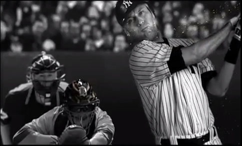
Today, as I was watching television, a Gatorade advertisement came on. It was an example of the classic sports drink ad, featuring various athletes achieving incredible feats with the drink logo not-so-subtly plastered on a cooler behind them. This particular ad features a tennis player trying to return a ball, a baseball player trying to hit a pitch, and a quarterback throwing a pass, all in slow motion. As each of the players' actions slowly progress to their separate climaxes, phrases such as "when it matters the most", and "every game needs a hero" are displayed.


This ad makes use of several different tactics to imprint itself in the mind of the watcher. First, it shows much more in its ad than effects of the product, and attempts to create lovemarks in doing so. It shows athletes performing well when they drink Gatorade, implying that Gatorade makes one like sports stars. People that want to do well and stand out respond to this, as star athletes are widely admires. In essence, Gatorade tries to link 'sports star' culture with their drink, in the hope that people will correlate the two, and buy Gatorade in the hopes that they could be like those who are showed in the commercial.

The commercial also uses several of the 15 advertising appeals characterized by Jib Fowles. The most prominent of these is the sixth, the need to achieve. The athletes are all shown as they are about to become the hero of their team, and it is implied that if they succeed, fame and glory await them. The commercial imposes the phrase 'with the whole world watching' just before all of the athletes are shown succeeding, and giant crowds full of flashing cameras are always behind the athletes. The athletes all begin to sweat the colors of Gatorade just at the pivotal moment that led to their success, seeding the idea that it was the Gatorade that enabled them to achieve. The ad also tries to create the need for achievement, as well as fulfilling it. The phrases 'who will come through' and 'with the whole world watching' instill the need for achievement, as it is implied that success is being threatened by others, and because the viewer is made to believe that everyone is watching. The belief that the viewer is being watched helps make them want to achieve, as failing in front of a large audience is undesirable.

Gatorade also uses the need for dominance to entice its viewers. The quarterback is seen dodging opposing players. He weaves around them, and in the end defeats them and is able to throw the pass. The commercial plants the need for dominance with the phrase 'who will come through' and fulfills it by showing all of the players triumphing over their opponent.

Sunday, December 2, 2012

HIMYM Product Placement

Today, as I was watching a rerun of How I Met Your Mother, I noticed a hidden advertisement for Green Hornet. Several characters were in a meeting, discussing building plans, and when the camera changed views suddenly, a laptop with the words 'Green Hornet 3D' was visible.


I think this is not a very effective advertisement. I was annoyed by the way it was obviously inserted into the show with no explanation and no context. There is nothing it could be but product placement. I thought it detracted from the show, and was just another reminder that I was watching TV, and that the show wasn't actually real.

I think the reason this ad failed was that it was not subtle enough. The ad execs interviewed on the Frontline episode about advertisements said that if the watcher notices that there is product placement, then it has failed. The image above only appeared for a few frames, so it is possible that the viewer might not see it, but then what is the point of the ad? There are two possible outcomes of this ad: the viewer notices, is annoyed, and dislikes the product; or the reader doesn't notice and nothing changes.

Old Spice Body Wash Commercial

While watching TV today, the now-classic Old Spice commercial featuring its well-built mascot came on. As I was watching, it occurred to me that this commercial had entered into the realm of popular culture simply by being an ad; there were Youtube videos parodying it and countless commentaries done by other Youtubers. How did Old Spice get their ad to be so popular?


Old Spice used humor to get the watcher's attention and affection, and used the ridiculous environment around the mascot to create a mindset of awe and wonder. Finally, the commercial tells you that, while you can never be him, you can at least be like him by buying their product.

Old Spice is effectively using lovemarks to advertise a culture around their product, rather than advertise the actual product. They say that you can become one of these confident, hunky, good-smelling people by using Old Spice, and it is effective because of the way they use humor to get the viewer on their side.